Enlighten

Parallel Prototyping

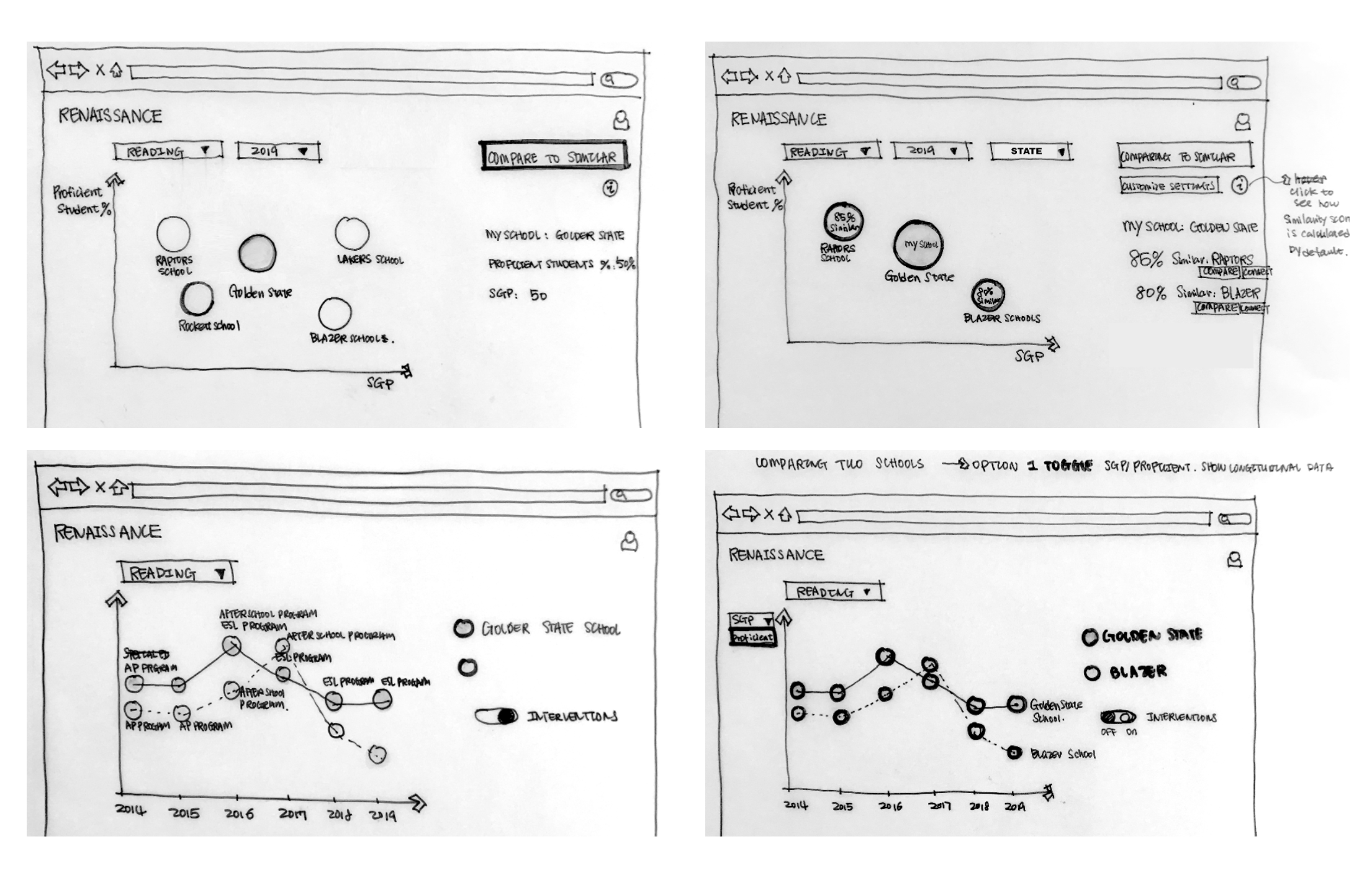
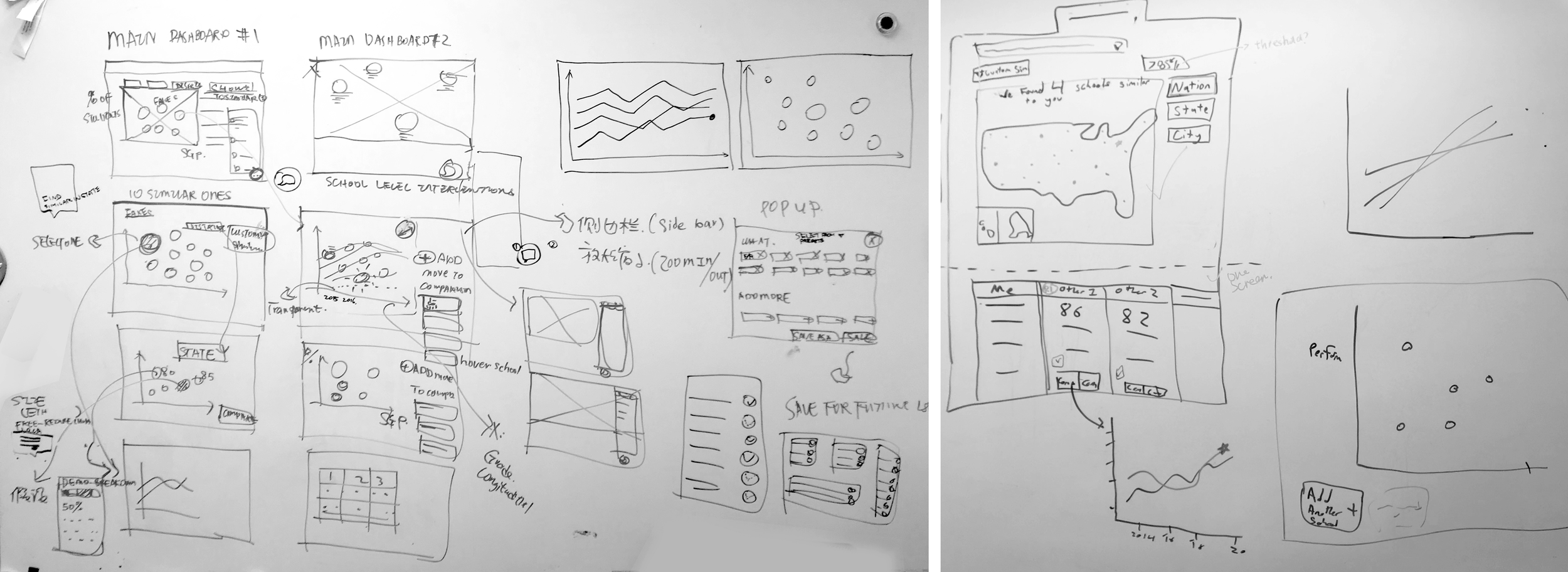
Prototyping allowed us to rapidly evaluate design alternatives so that we can improve our product usability, We started by developing several different ideas including line charts, bubble charts, as well as map diagramming to represent school geographic information.

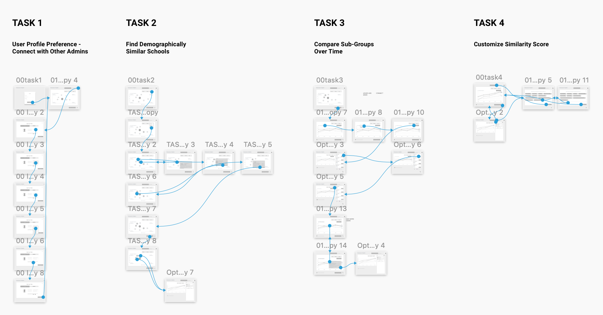
From the early heuristic evaluations with some experts (district administrators), we have a list of feedback as follows, which guided us on generating our low-fidelity paper prototyping:

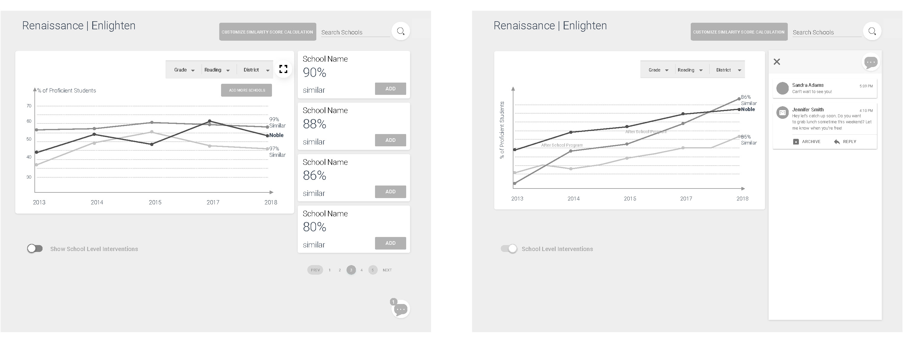
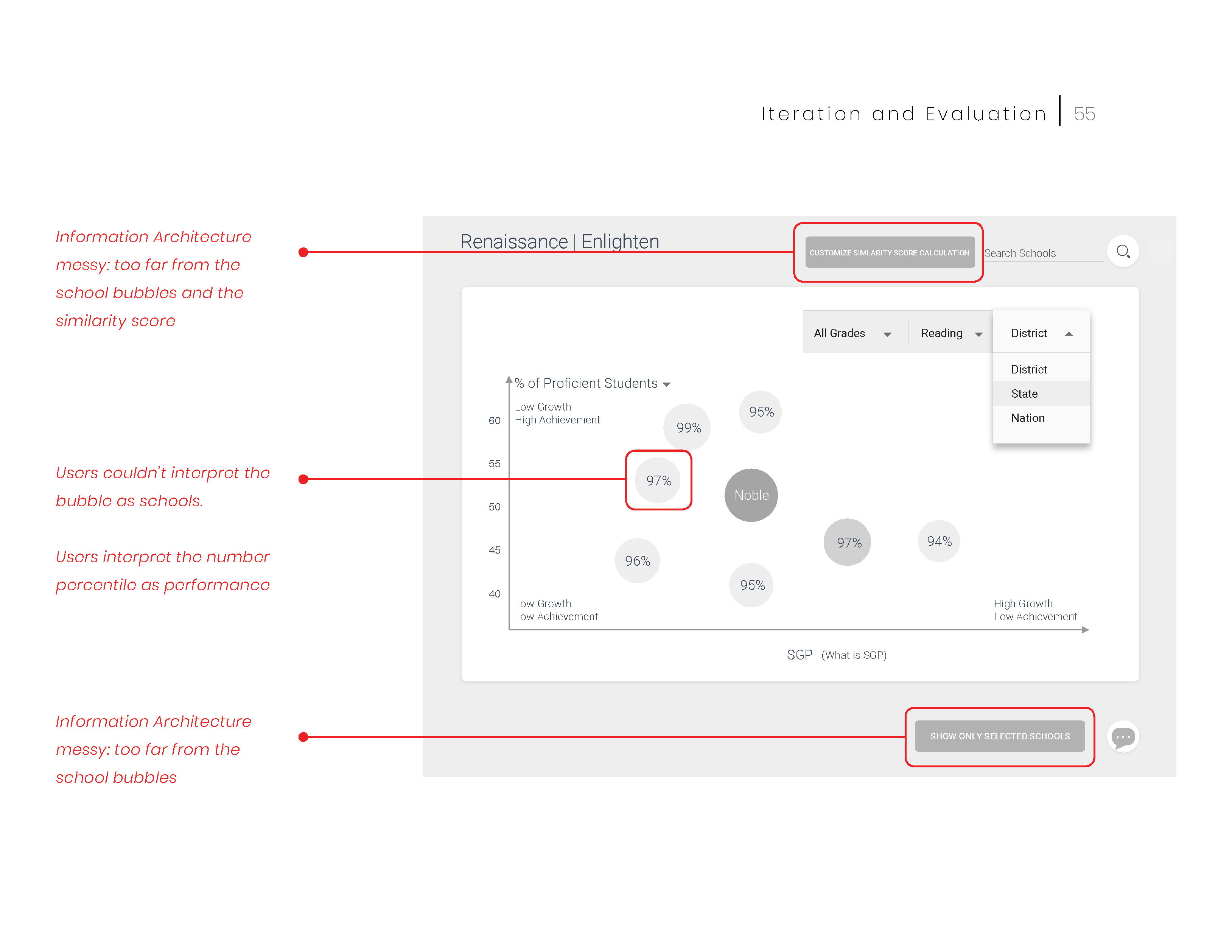
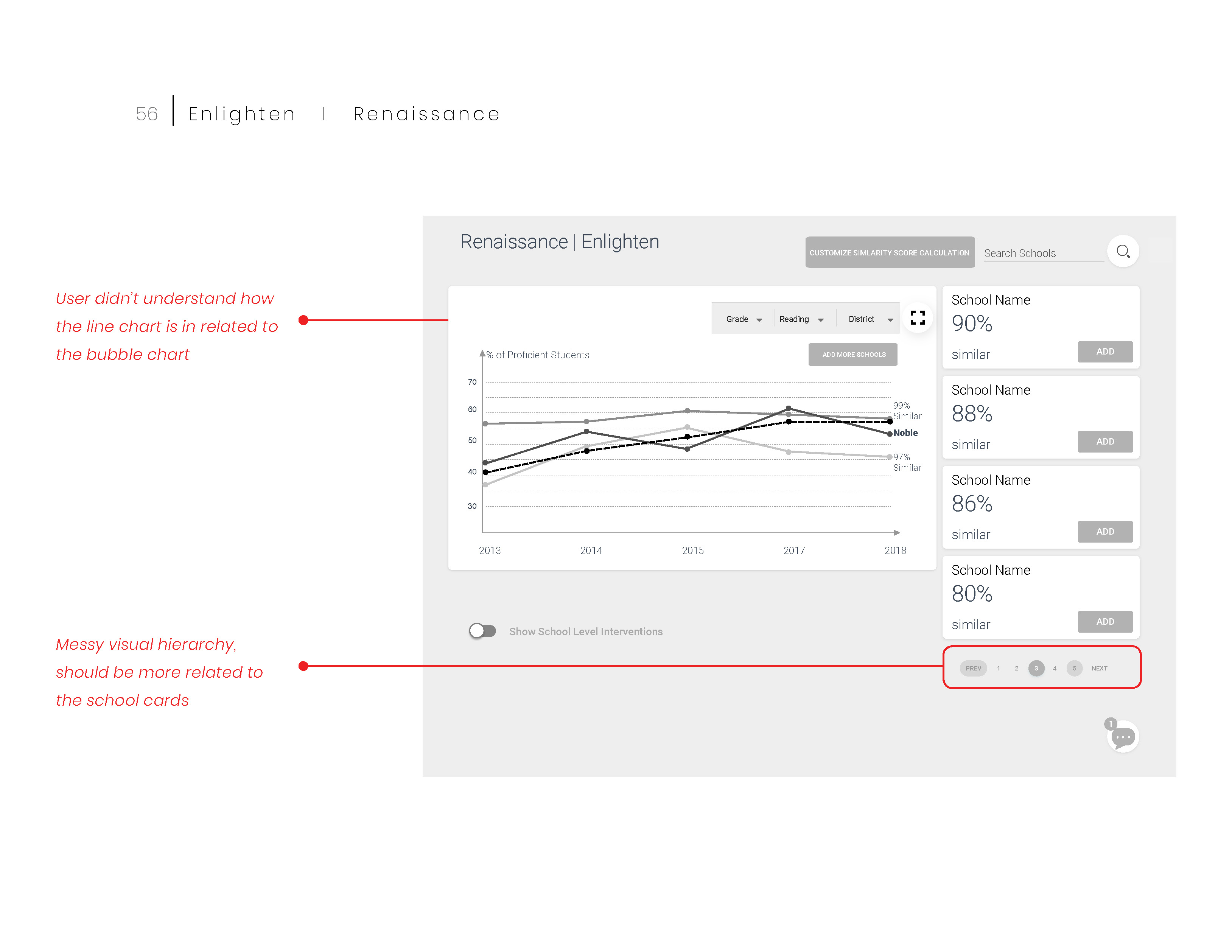
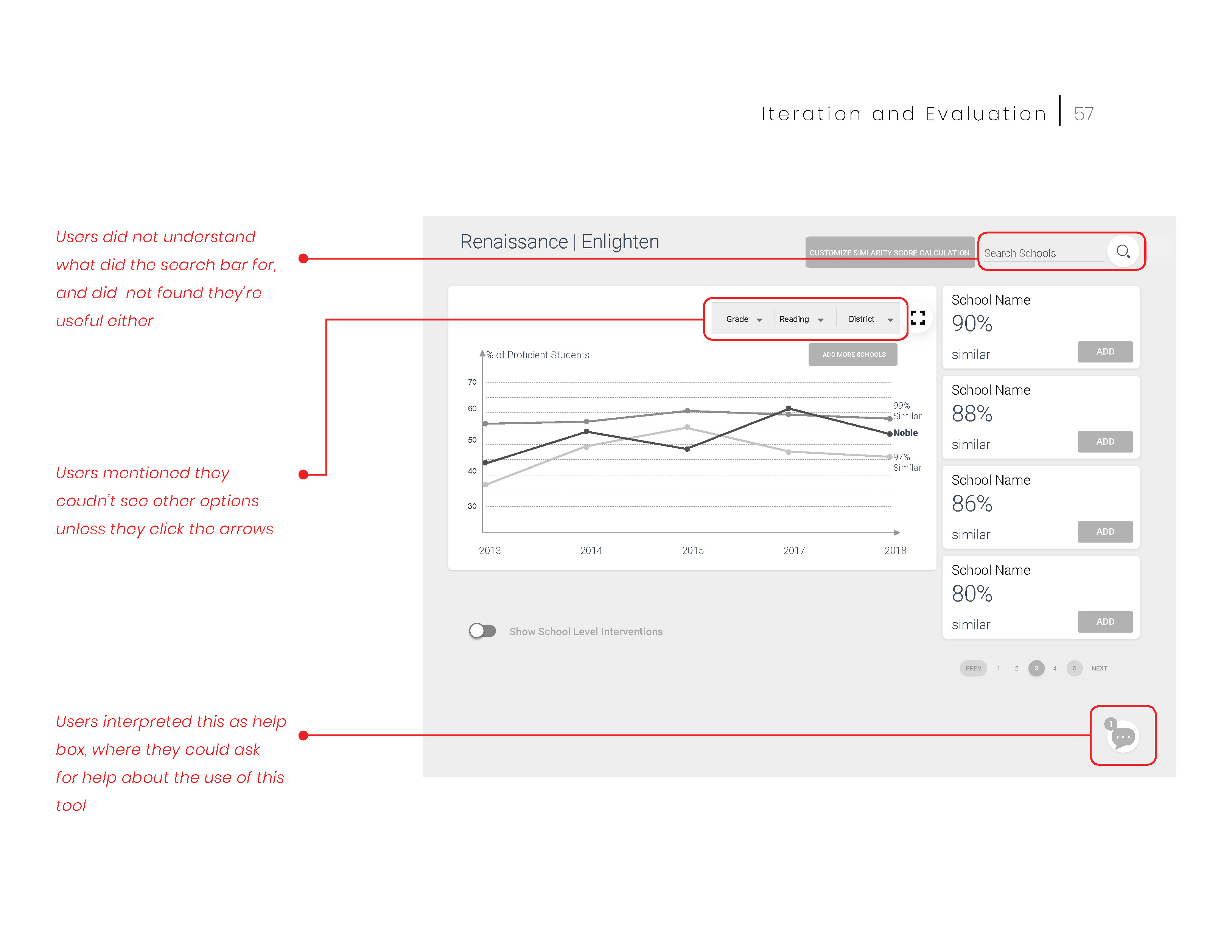
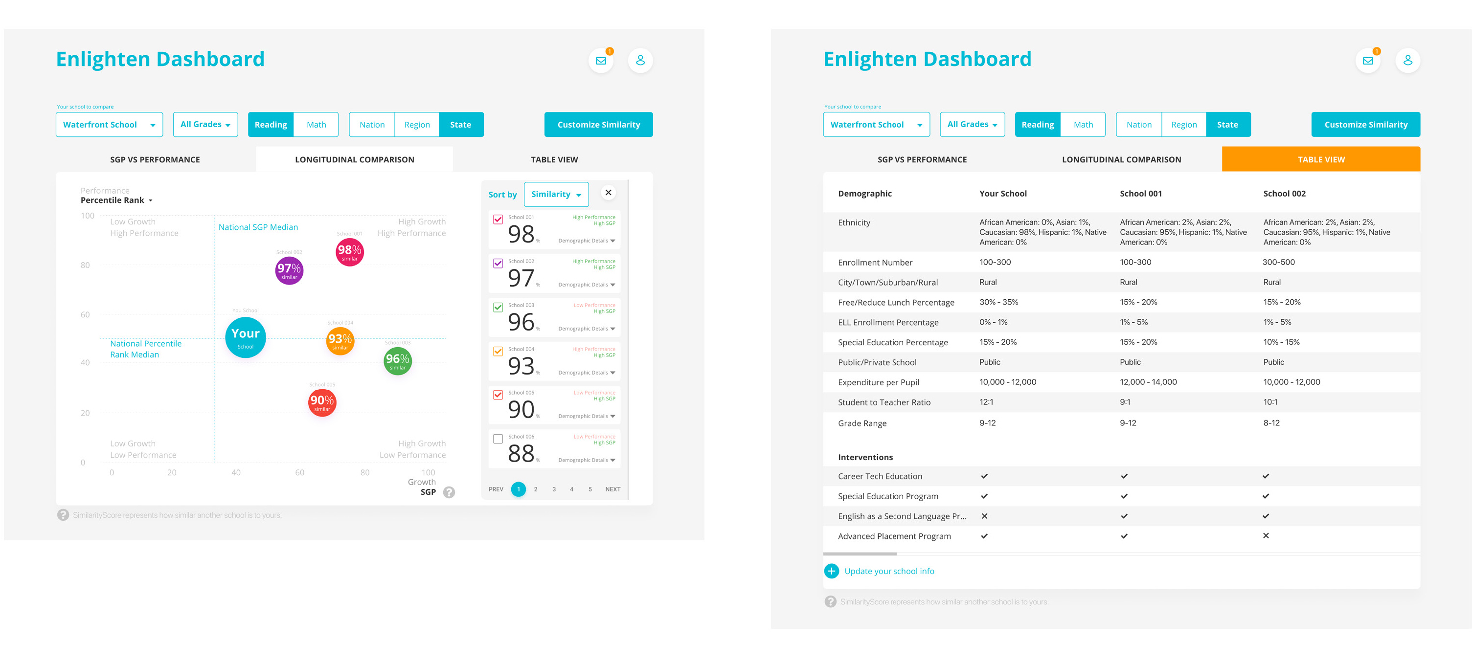
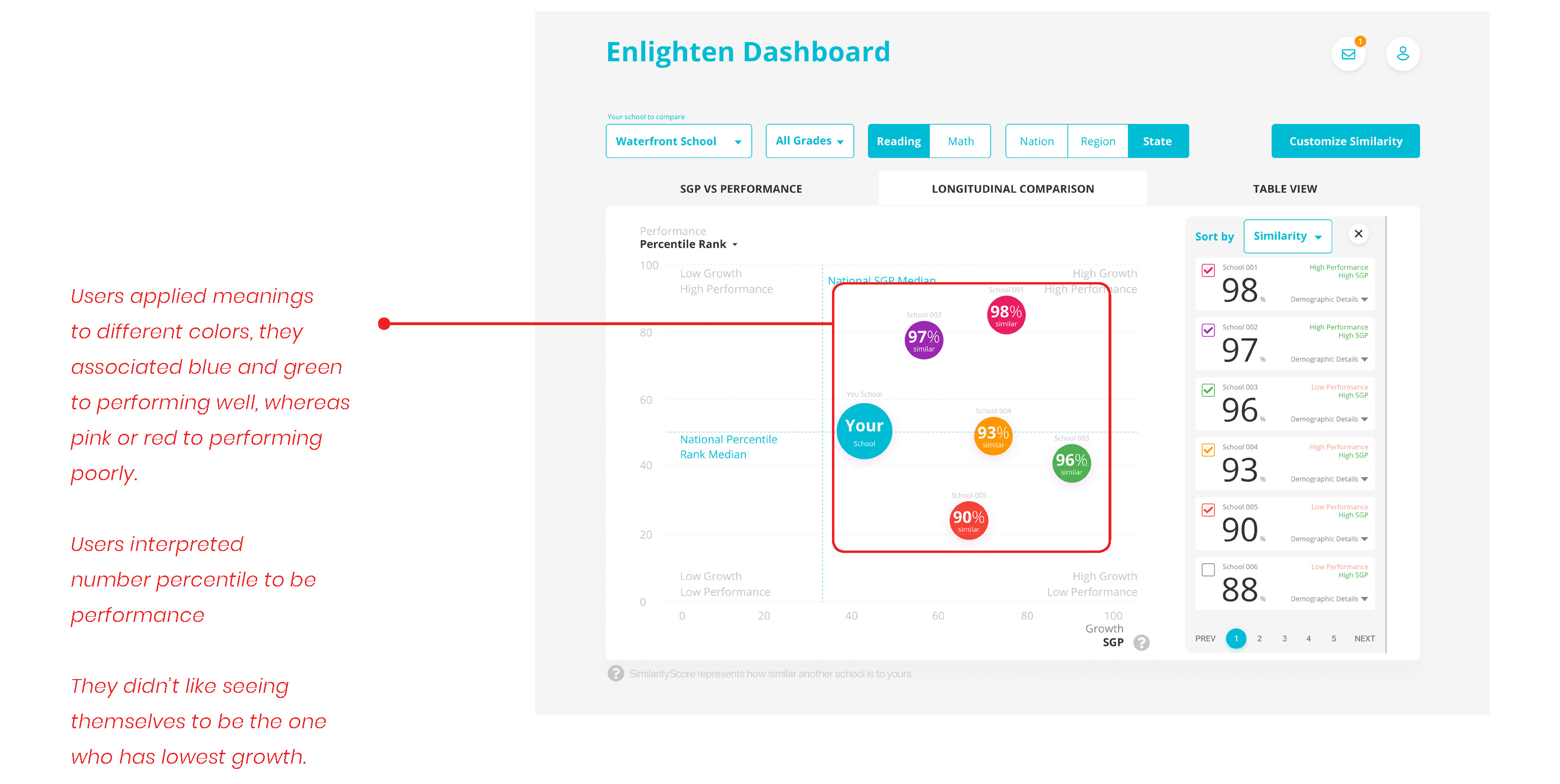
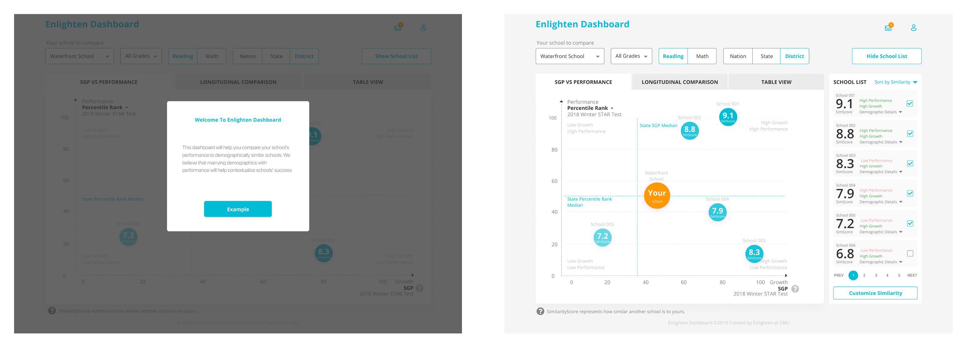
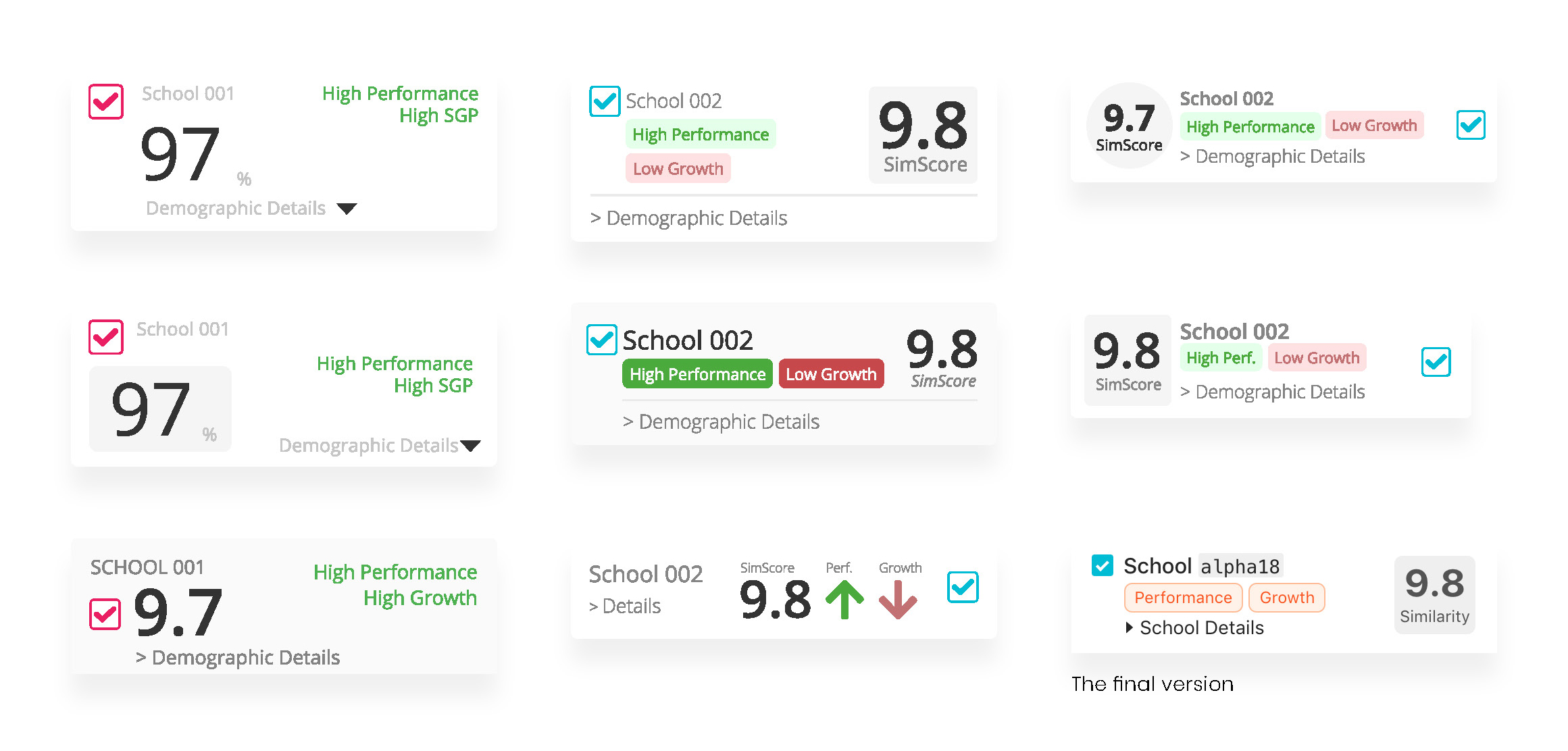
Users generally liked both bubble charts and line charts, as bubble chart is a better way to represent different schools, while line charts can provide a better opportunity to show longitudinal data.

Users think it’s nice to see the geographic information of other schools, mostly for fun, but the map diagram is not as useful as bubble charts showing schools’ performance and growth, and line charts which can represent schools’ longitudinal comparison.

Low-Fidelity Prototyping

We then quickly generated a low-fidelity prototype and did two rounds of usability testing. We first tested with two fellow designers to get feedback on the usability and flow, then we redesigned our prototype and test again with several district administrators. The key takeaways are the identified usability issues as follows:

Users mentioned that they worry about the intervention data and would like to see the working prototype to see if this function provides the information needed

Users like the bubble chart and line chart, but want to be able to have drop down menus to change setting, such as grade level, region, and subject.

Users were also worried about he fidelity of the intervention data because different schools may not put the same amount effort on keeping track of the intervention data.

Mid-Fidelity Prototyping

After the first round of testing, we started working on the Mid-Fidelity prototype immediately. The main focus this time was to improve the visual hierarchy and streamline different use cases. We developed the Mid-fi prototypes by defining four different tasks:

1. Set the preference of if willing to connect with other school, the purpose of this was also to protect schools’ privacy and give school options if they’d like to be connected or not.

2. Find demographically similar schools on the main dashboard

3. Compare demographically sub-groups’ performance and growth overtime - longitudinal data comparison.

4. Customize similarity calculation based on users’ need and special use cases.

To improve Visual hierarchy, and improve users’ experience of reading flow, we also added the card pattern. Different card set different zones for different chunk of information.

Testing Round 1 - Usability Testing

Through these sessions, we found a number of places that we can improve our design:

Users do not immediately interpret the bubbles as schools

Users do not understand the purpose of the searching function

Users interpret the chat icon as asking for help from the system

Users were not able to find the median of either growth or performance scores

Information organization is rather messy, with the ‘customize similarity‘ button on top and ‘show only selected school‘ down at the bottom

Users were not able to associate the Customize Similarity Score function to the schools bubbles. That’s also a second reason why users had a hard time understanding the bubbles represent schools’ similarity.

Hi-Fidelity Prototyping

In developing the Mid-Fi into our Hi-Fi prototype we made a number of sweeping changes which include:

Re-organized Information Architecture
Based on our team discussion, we chose to make the school bubble charts and line charts as two parallel view options, rather than a linear flow. Users previously had to see bubble chart first and then select the schools they want to compare, after which they could view the longitudinal comparison. Now, administrators could toggle between either as needed.

Added Sorting Function
We added four different ways of sorting schools: by similarity, by higher growth, by higher performance, or by a combination of all three factors, named “Recommended

Added Table View
Another big change we made was adding a table view, where users could find more detailed demographic comparison among different schools. The table listed a side-by-side breakdown of all the demographic data we had available for user-selected schools.

Improved Components Design and Readability
We revised many components, for example we changed the test subject and region settings from drop-downs to tabs, so users could easily know what other options are available without needing to click more.

Testing Round 2 - Experience Prototyping

After we developed the first rounds Hi-Fidelity prototypes, we conducted around 10 sessions of experience prototyping, to further test our prototypes and validate our design.

During this round of testing, we found the following issues:

The district administrator apply meaning to different colors. They have a mental model of green or blue represents students performing well, while red or pink represents students not performing well.

They interpreted the similarity score as performance.

They didn’t understand why the tool chose the 5 schools for comparison. Also, some users mentioned that seeing my school to be the one with lowest performance and growth made them feel bad, emotionally.

Hi-Fidelity Prototyping Iteration

After we developed the first round hi-fidelity prototypes, we conducted around 10 more sessions of testing to further validate our design. Some difficulties in users’ workflow arose, which we resolved in the following ways:

Update School Bubble Colors
The district administrator applied meaning to different color. They have a mental model of green or blue represent students performing well, while red or pink represents students not performing well. Based on this, we updated the prototype so that all schools have the same primary color.

Add on-boarding instruction
We also realized that non-Renaissance and novice users may be unfamiliar with common design patterns in the district dashboards, such as using bubbles to represent schools. We chose to add some instruction up-front to help users understand what our representation meant.

Added Table View
Another big change we made was adding a table view, where users could find more detailed demographic comparison among different schools. The table listed a side-by-side breakdown of all the demographic data we had available for user-selected schools.

Update Similarity Scale
A major finding is that administrators usually relate a 100 scale score to student’s performance. So when they saw the SimilarityScore as a number out of 100, they often interpreted it as the schools’ average performance. To reduce confusion we also changed the score scale to be out of 10.

Testing Round 3 - Semantic Meaning Testing

Once we have all the major problems solved, we did a round of testing focusing on semantic meaning to ensure all text and buttons convey their intended meaning clearly. For example, we tested different options for the action button on the on-boarding pop-up window. We chose to use “you/your” to refer the users, and use “we” to refer to those internal to the system.

Iteration Is Important

Other than the major updates, we also iterated on visual representation and visual hierarchy, not only to make the product more visually attractive, but also to make information easier to read.