Enlighten

Final Testing and Evaluation

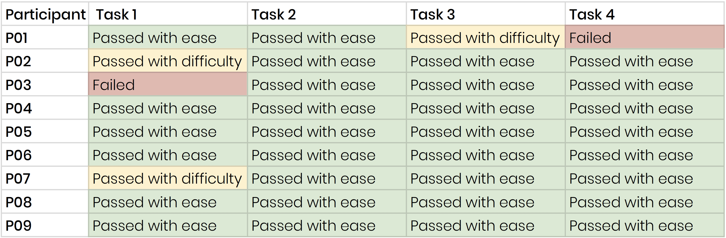
Our final testing consisted of nine administrators, remote and five in-person. Six of the nine were Renaissance users, and none had seen our product in development, ensuring our testing results would be unbiased.

To test participants, we began each session by introducing the dashboard’s purpose. Participants were then free to explore while thinking aloud, so we could understand how users interpreted elements and used the dashboard. We then asked participants to complete several tasks to test the usability of our dashboard’s primary components. To conclude, we asked users to complete two surveys, on about usability and value, the other about similarity factors.

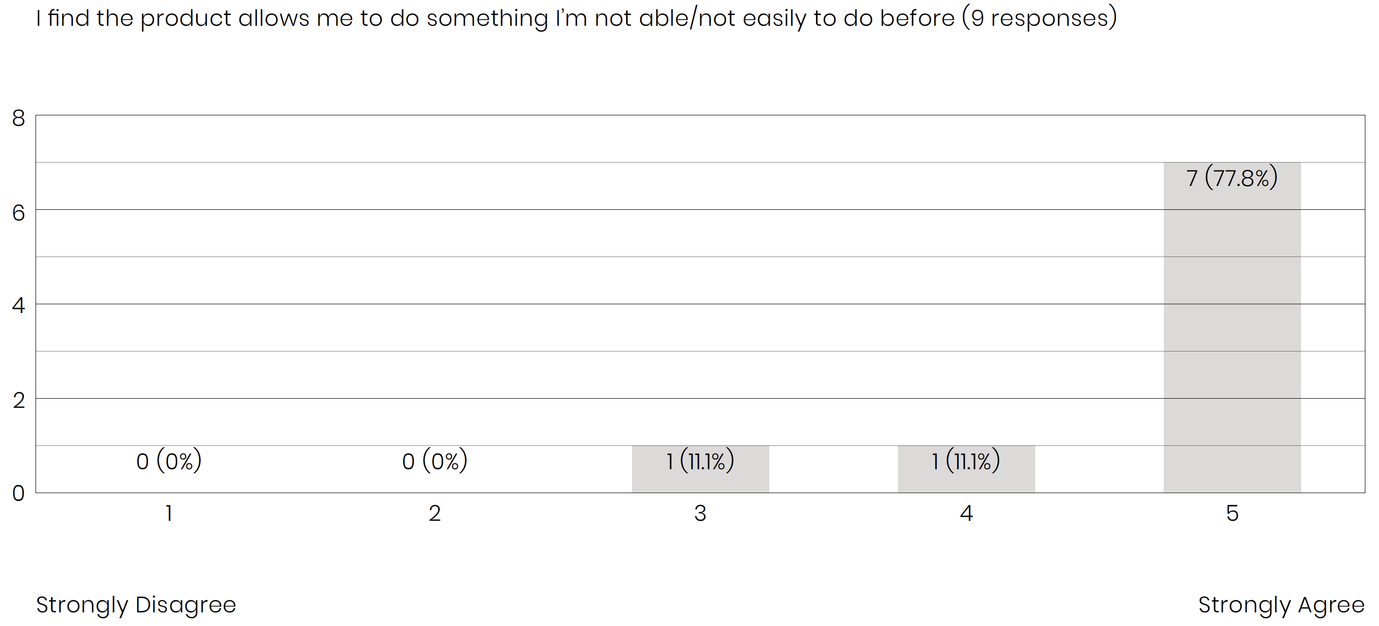
To understand usability we used the System Usability Scale (SUS), an industry standard survey used to compute a usability score. Our SUS Score is 82.5 indicating high usability, and translates to an A on an A-F scale.

Testimonials

Our dashboard has been met with glowing remarks. The Enlighten Dashboard has been widely considered simple, usable, and valuable to the work of administrators.

Here’s what participants say:

“I think it’s a great product. I would use it. I would recommend it to other colleges. I would use it for demonstration purposes. It does a lot of the things that I have been searching for and looking for a long time. I can see a little bit of refinement and improvement, but my goodness, my first out of the gate look it’s really helpful and impressive.”

“I just like the idea too that you’ve chosen schools so I don’t need to go through each one of them. That tool is very very helpful.”

“I think it’s great. I think it’s interesting. I think it’s pretty informational. The connection of the schools that are growing would be good. It’s vital, it’s pertinent information to have.”

“I’m not able to compare Star data across other schools in the state so that’s huge”

Provide Real Value

Our research showed that administrators find real value in the ability to compare and connect their schools to others. While this is currently possible for public schools through state data, there would be a fair amount of work required for administrators to download, analyze, and understand this data on their own. The Enlighten Dashboard simplifies the process, providing novelty without the expense of complexity.

Ease of Use

Final testing revealed that the SimilarityScore was difficult to understand. Users frequently related SimilarityScore to performance, while our score purely describe the homogeneity between two schools . The onboarding that introduced the concept was often skipped by users, and our label “SimScore” was easily confused.

We reacted to this after the first few sessions by changing all the labels to “Similarity”, simplifying the onboarding, and providing additional verbal explanation. This helped greatly, with our final few participants understanding the concept instantly. Our first task given to participants asked users to “locate 2 similar schools”. Notice that after an initial few errors in this task, we created changes letting the rest of the participants passed the tasks with ease.

Willing to Connect

Across the board, administrators have praised our “Connect” feature. The ability to connect and collaborate is seen as a powerful way to facilitate professional communities dedicated to improving education for all students.

Administrators were looking for a way to use the Enlighten Dashboard for school-wide improvements, but wanted deeper fidelity intervention data than we could provide. We found that communication would be paramount in helping administrators unpack what does and does not work at similar schools.

Connecting can effectively transform how K-12 professionals seek and implement learning solutions. It opens up improvement from a single institution to a collective act, where schools work together to test, iterate, and revise their students’ curricula and interventions.